Lead UX & Product Designer · AirRobe
AirRobe
A sustainable fashion marketplace built around a general persona.
AirRobe had a clear company mission, a real strategic bet, and a marketplace that wasn't gaining traction.
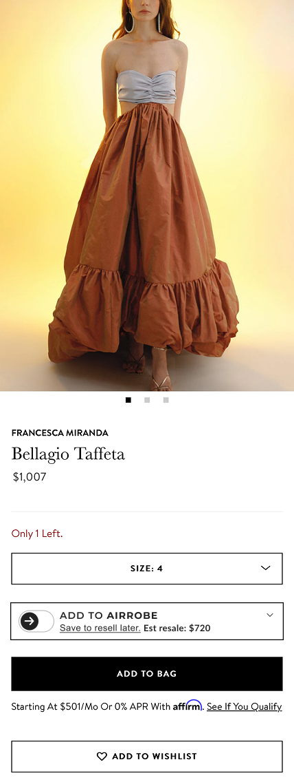
Sustainable fashion. Circular wardrobe. An “Add to Wardrobe” widget that sat on partner brands' product pages, capturing each item as part of a digital wardrobe the moment it was bought. The thesis was sharp. Roughly half of all apparel bought online gets returned, and brands sometimes throw the returned items away rather than process them. If customers knew they could resell later, they'd order fewer sizes to start with. The pitch was real.
What the company didn't have was a clear user.
After weeks of conversations and mockups, the work coming into focus was the kind you'd expect. Improve the marketplace UX. Integrate the brand widget cleanly. Make selling easier, make buying smoother. Standard product design work, on paper.
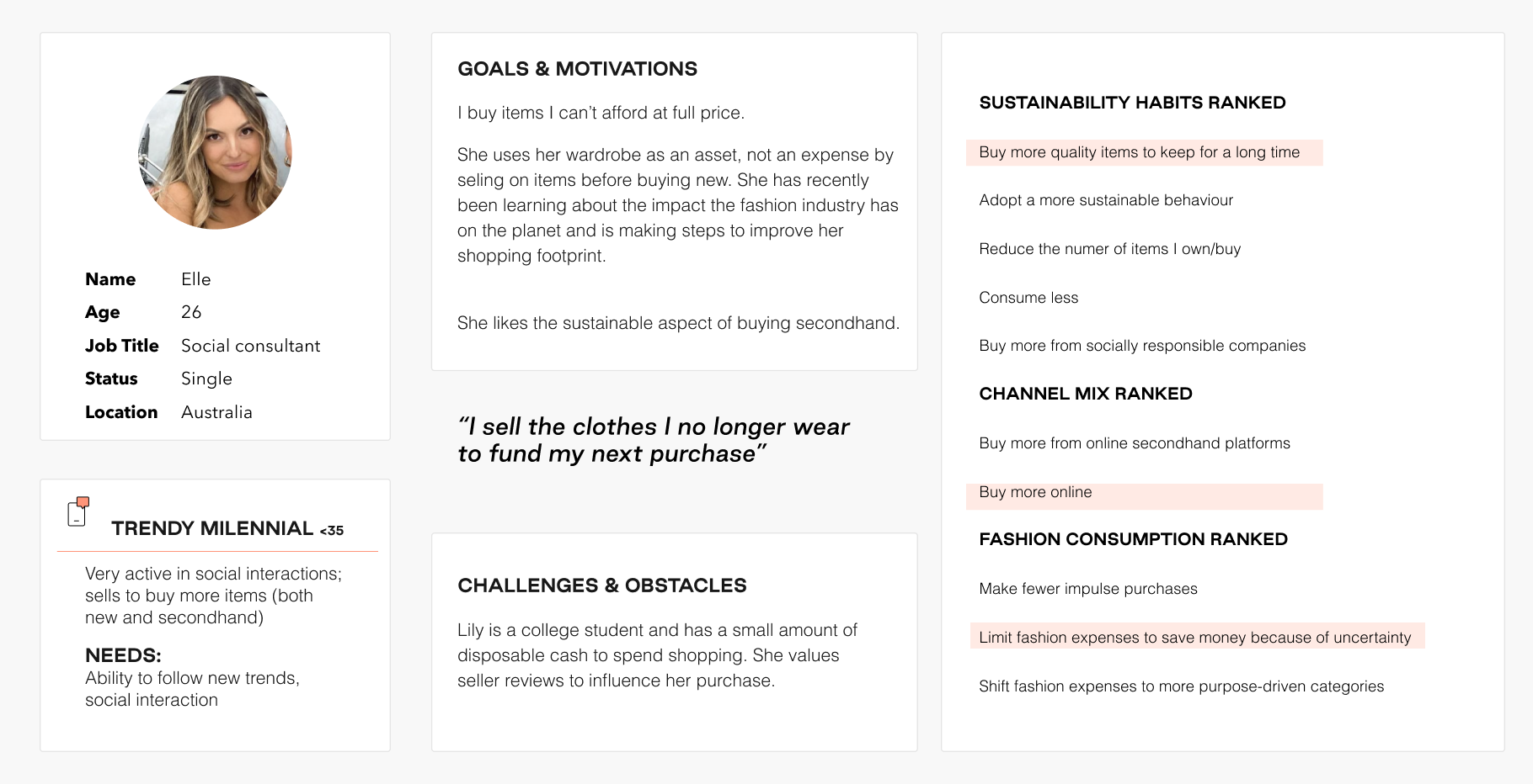
The deeper problem was that the team had only one general persona, sketched in early and not sharpened.
Three things were happening at the same time. The team was treating “the user” as a single abstraction when the data was showing something else. Multiple distinct people on the platform, each with her own reasons for being there. Sellers who wanted to sell were dropping out before they finished a listing. The listing process was just too time-consuming, even for people who were eco-conscious, needed the cash, and had quality items in their closet. And the buyer/seller transaction itself had wait states baked into it. Wait for accept. Wait for ship. Wait for arrive. Wait for money released. Each silence was a moment for trust to break.
We didn't know who our users were.
That observation was the work. AirRobe wasn't competing for one user. It was competing across four distinct user types, each with her own problem statement and her own obstacles. Designing for “the user” was wrong. The team needed named people they could actually argue about.
Four decisions followed.
The first was about who we talked to. We interviewed people who were motivated to buy or sell on a platform like this, not casual shoppers. A casual shopper wasn't going to keep a luxury resale marketplace alive, so the interviews focused on the people who would. That call shaped everything downstream.
The second was holding four personas instead of one. The pressure to consolidate is constant. One persona is easier to brief, easier to align around, easier to defend. Four felt like a luxury until you tried to design a single experience that worked for Trendy Taylor (twenty-four, college student, sells to fund the next purchase) and Cautious Chloe (thirty-seven, married, would start reselling to be more sustainable). They weren't using the same product. They needed different surfaces for different jobs.
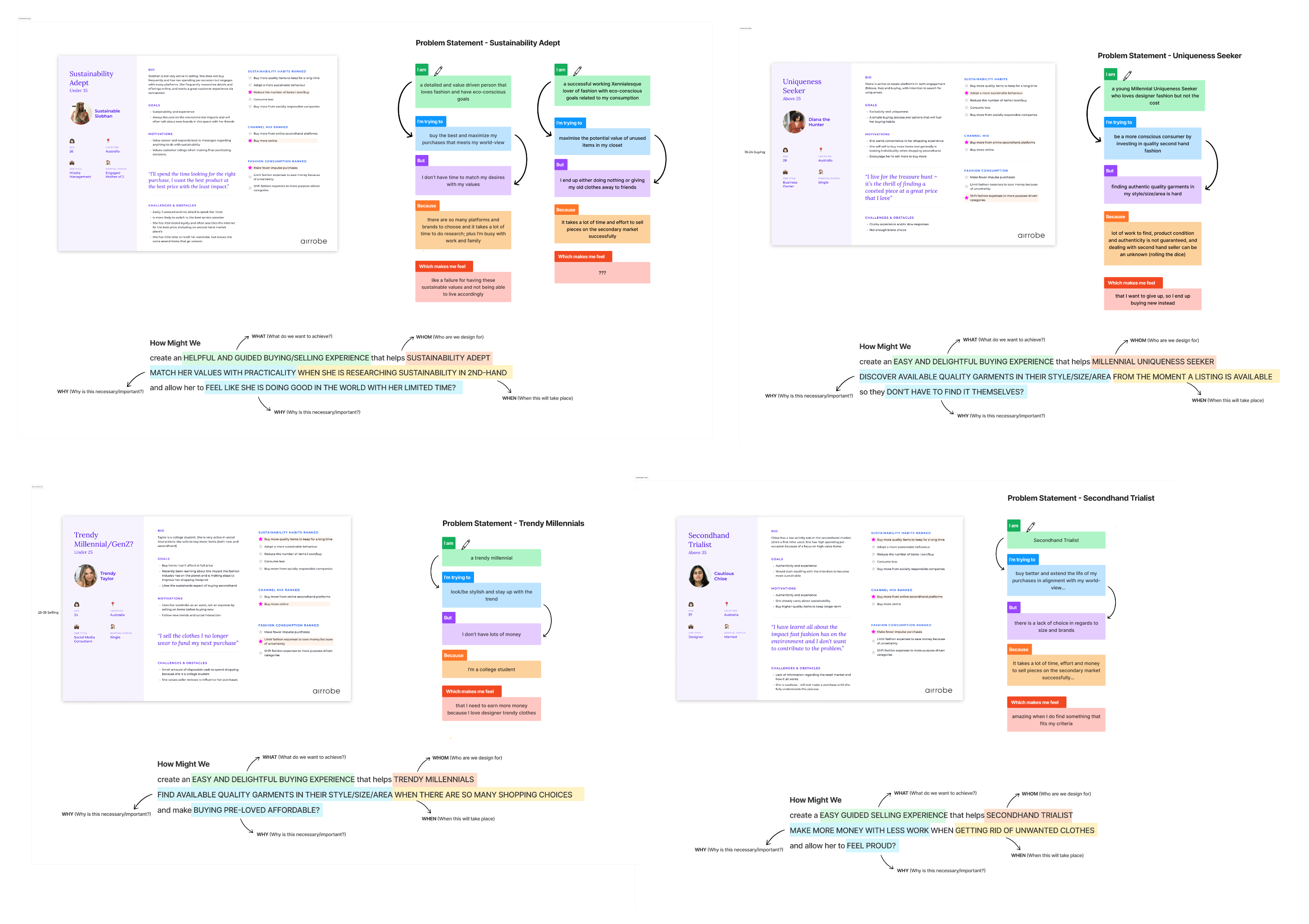
The third was the most uncomfortable. Sustainable Siobhan was the persona for whom one of the interviews didn't produce a clean emotional answer. I left her “Which makes me feel” box blank with a “???”. Most teams round up to a feeling so the persona feels finished. Honestly, not every emotional answer was going to come out clean from the interviews.
Leaving the question is the signal that the work is real.
The fourth was mapping what actually happened between a buyer clicking Buy and getting their money back if something went wrong. Five long waits. Wait for the seller to accept. Wait for shipping. Wait for arrival. Wait for the money to be released. That silence in the middle was where trust went wrong. The team had been treating this as buyers not trusting sellers. It was really about there being too much quiet in the middle. We added three messages along the way (an acceptance note, a shipping note, an arrival note) so the silences felt held instead of empty.

What I delivered was foundational, not finished.
Four personas the team used every day, in design reviews and in conversations with stakeholders. A buyer/seller comms flow that changed how trust was designed into the marketplace. A marketplace redesigned around what each persona actually needed. And a brand widget that finally had real people to design for instead of a blur.
The gains stuck. Over the following quarters, first-time retention rose around twenty percent, repeat purchases around fifteen, conversion around fifteen, and average order value through the brand-partner channel between twenty and thirty-five depending on the partner.
Honestly, the marketplace still ran into the same hard things every peer-to-peer luxury resale platform runs into. Verifying that what people are selling is real. Handling returns. Holding onto the money until both sides are satisfied. No UX work fixes those. The persona work and the comms flow made the marketplace as well-designed as it could be inside those constraints. And the brand widget, more than the marketplace itself, was the part that made AirRobe a real business. My job was to make the widget land by giving the company named people to design for.
What I'd keep from this project is the four personas themselves. The team had a working sense of one general user, eco-conscious and motivated to resell, somewhere in the millennial-to-Gen-Z range. The interviews showed something else. Four distinct people with four different reasons to be on the platform, none of which collapsed cleanly into the others. We named them precisely, built them from what the interviews actually said instead of the working idea we'd started with, and left Sustainable Siobhan's emotional box blank when her interview didn't answer it.
“The user” is usually shorthand for several different people the team hasn't separated yet. The discipline is letting the interviews tell you who's there, and naming them.