Lead Designer · Tankfarm
Tankfarm
Building a brand voice for a propane company competing with the providers its residential customers had trusted for years.
Tankfarm called me back as Lead a couple of years after I'd left. I was glad to be asked.
The Tankfarm I was rejoining was a different company than the one I'd left. The old Tankfarm had been a SaaS partner to propane companies. Lead engine, customer management, the digital plumbing that businesses across the country leaned on to keep their books and their delivery routes. The new Tankfarm was the company competing with them. Trucks, drivers, warehouses, installers, inspections. Same customers, opposite side of the table.
The team I rejoined was familiar in the way mid-pivot teams are. There was no design function yet. The engineers had been carrying the design work themselves, with no real bandwidth for it, and the brand and voice didn't have clarity. A new digital marketer had been brought in to lead growth, and I'd come in to lead design. We were both new to a company that was trying to become something it didn't yet match.
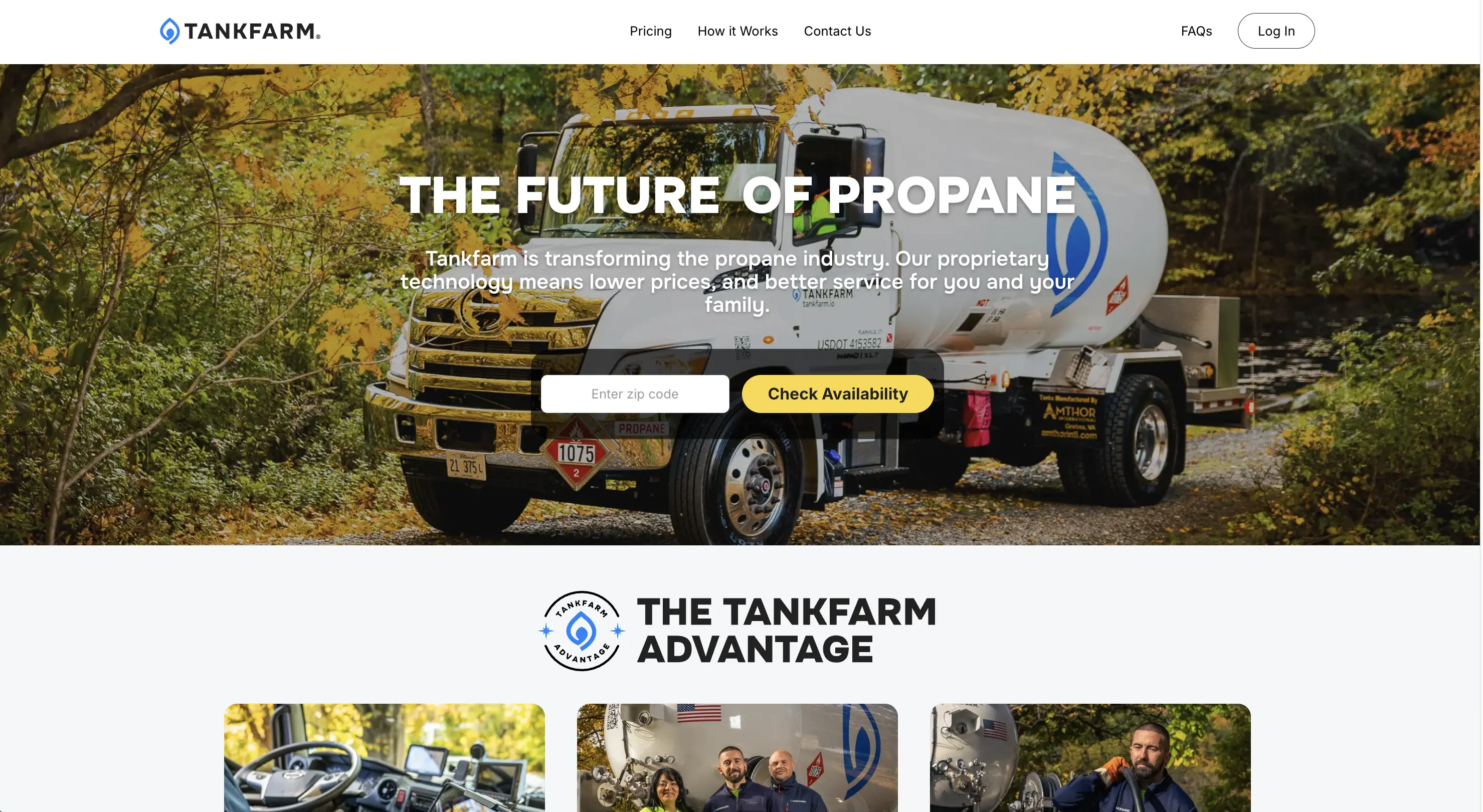
The early conversations kept circling the same shape. Create warmth and trust through tone, voice, and visual design. That was almost right. There was something real underneath. The instinct was right; the words for it weren't.
The brand wasn't being asked to introduce warmth into a cold company. It was being asked to navigate a tension nobody had said out loud. Customers already trusted other propane companies. The ones Tankfarm was now competing with. The voice couldn't say modern alternative. It had to say we're the kind of trustworthy propane company you've always known, just digital and reliable.
Three hard problems sat on top of each other. The identity pivot was the obvious one. The brand had to navigate competing with the very companies customers had trusted. Warmth in a cold category was the second. Residential propane defaults to dry utility or cold corporate, and warmth at scale is craft. The third was the moving target. The company we were branding hadn't fully become that company yet. Each of those alone would have been a project.
I went to the customer feedback. Tankfarm's own customers, and the customers of the propane companies Tankfarm used to partner with. Those companies ranged from small mom-and-pops to larger names like Petro.
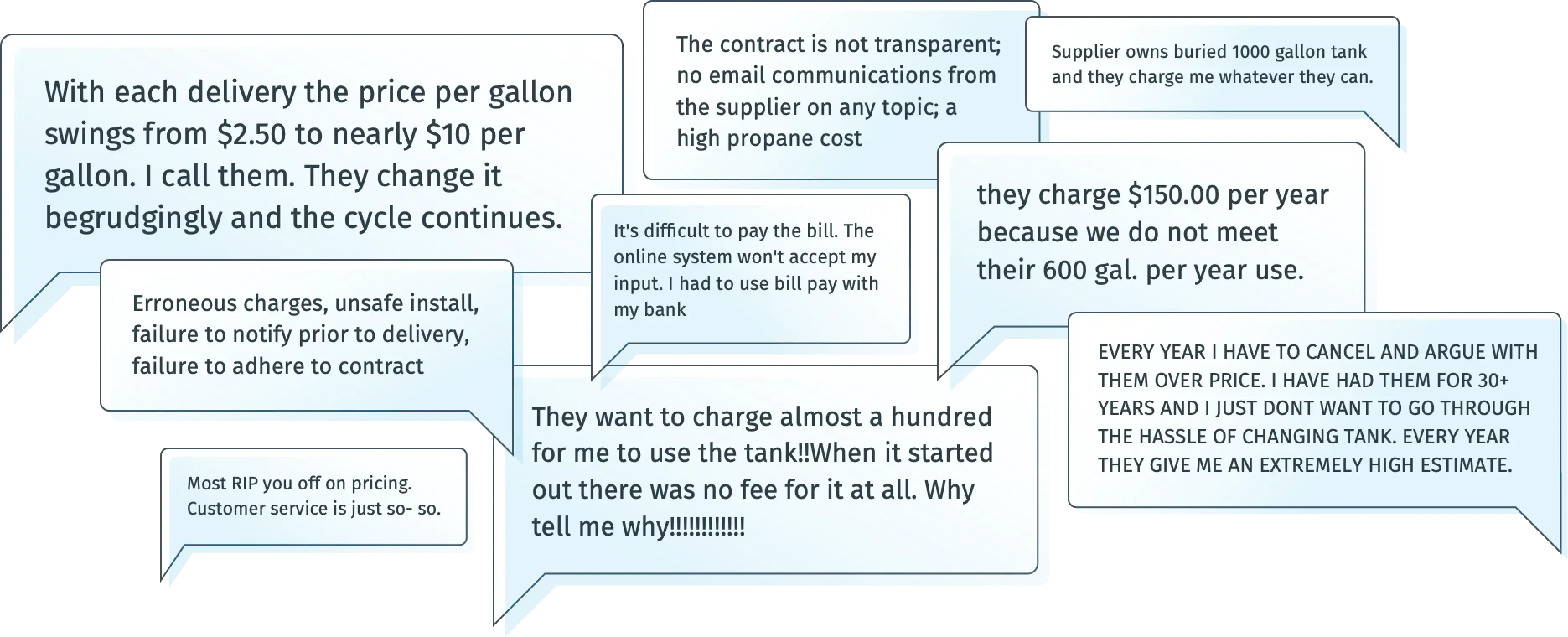
The customers of those companies were frustrated. They felt misled on opaque pricing. They didn't like the service on the phone. They didn't like the in-person interactions. The trust that had once held the relationship together had quietly stopped being earned. Tankfarm's customers, by contrast, already perceived the company as friendly, caring, personally attentive. They liked the personal communication.
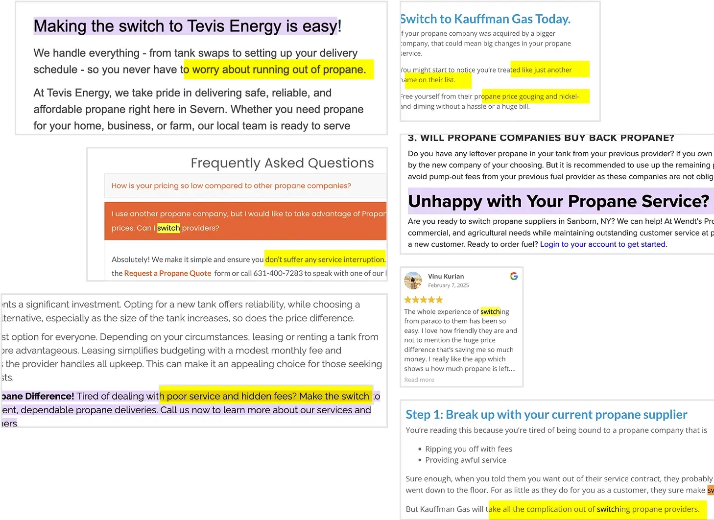
Reading the two sets of feedback back to back showed what was actually going on. The category's warmth wasn't broken because warmth was hard to deliver. It was broken because the older companies had stopped treating customers as relationships and started treating them as billing accounts. Tankfarm wasn't competing on price or service quality.
They were competing on trust the older companies had stopped earning.
The work didn't need to introduce a new position. It needed to amplify a position the customers had already given the company.
That reframe led to three decisions.
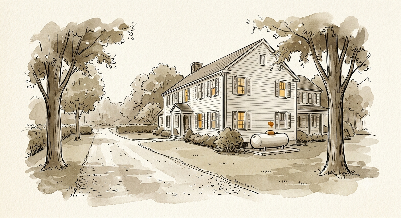
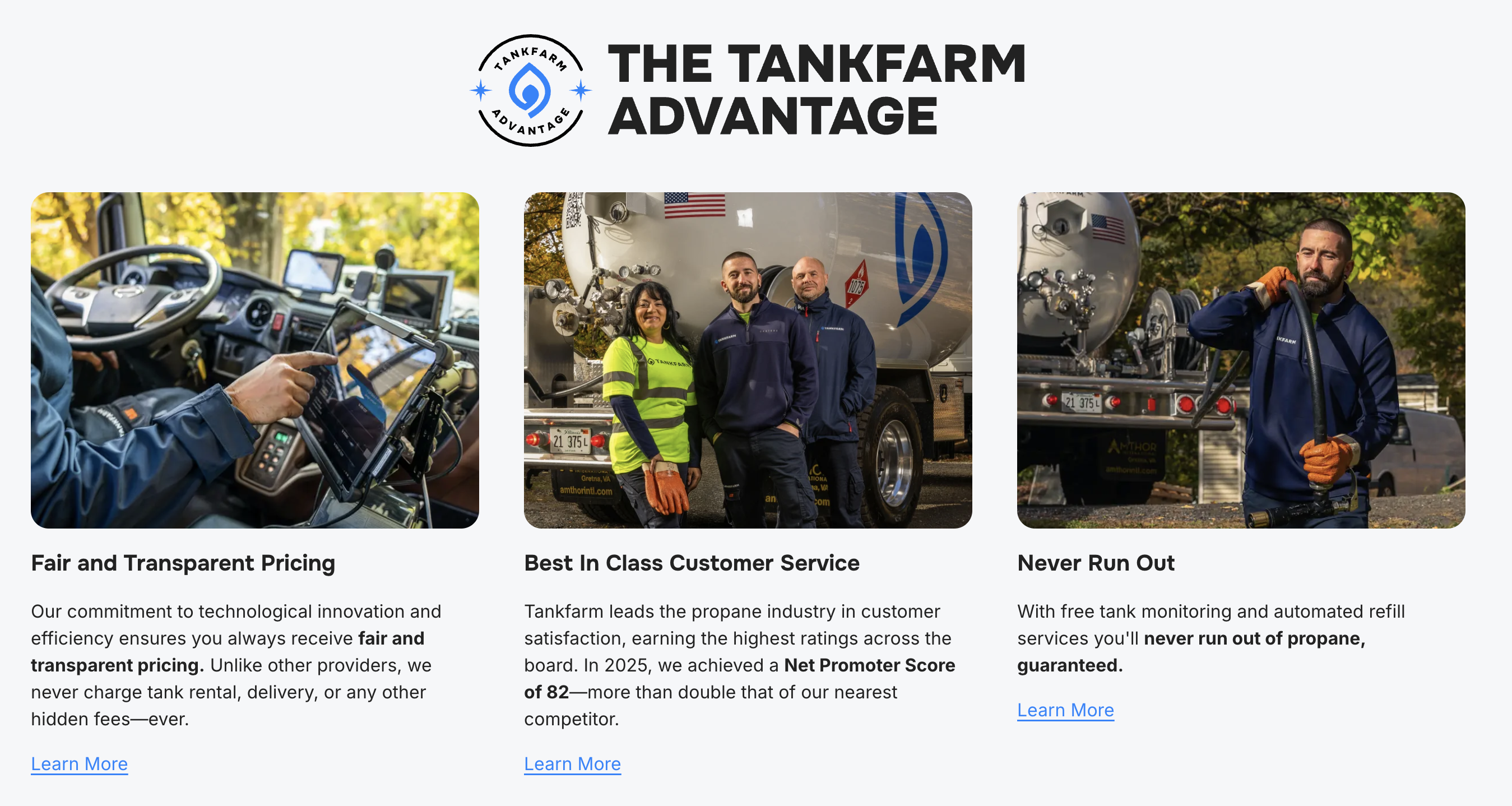
The first was visual. The default vocabulary in residential propane was either cold corporate (gradients, abstract icons) or stocky lifestyle (smiling families around fire pits, generic suburban homes). The customers had been seeing both for years and didn't trust either. What we used instead was a documentary-feeling photo direction. Hero shots of the operators, installers, and drivers who actually do the work, presented as themselves. Landscape photography of real homes, with propane tanks visible in the corner of the frame. Not hidden. Not staged. Just part of the place. The tank is part of the home. The people behind it are real.
The second was about lead qualification. Tankfarm couldn't serve everyone. Not the 5-gallon BBQ-propane crowd. Not the customers whose usage didn't match what the company could deliver. Bad leads slipping through cost customer service real time. The existing onboarding had been built to filter aggressively: a long form, many questions, a lot of drop-off in the middle. We cut it down to the minimum set of questions that still did the qualification work. Fewer steps for the prospect, fewer unqualified leads landing on customer service desks. The qualification didn't loosen. The asking just got shorter.
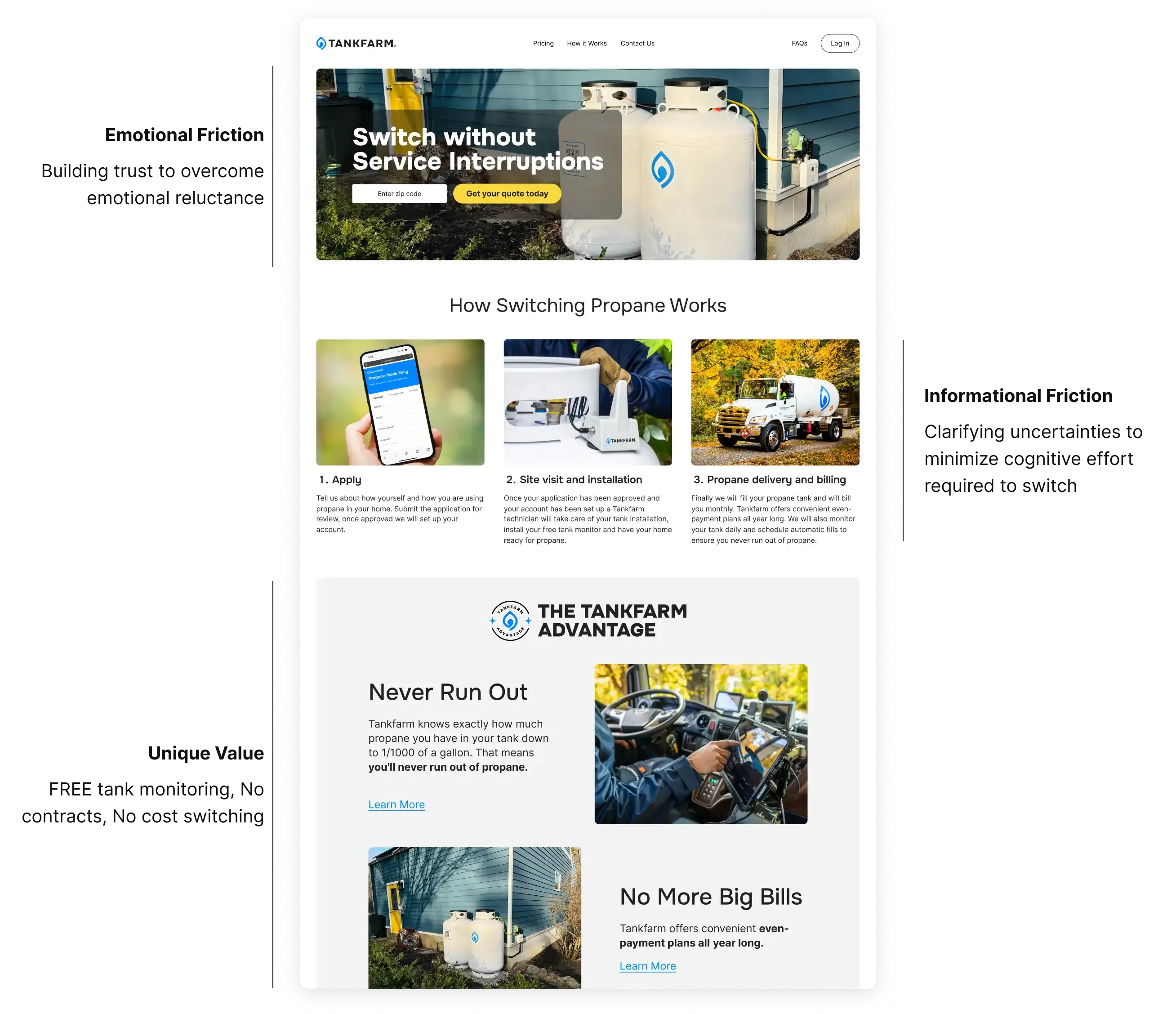
The third was plain language. Pricing visible in dollars, not buried in fine print. Status messages in customer terms, not internal codes. In a category whose customers had been burned by opaque language, plain language was the trust mechanism, not a content-strategy nicety.
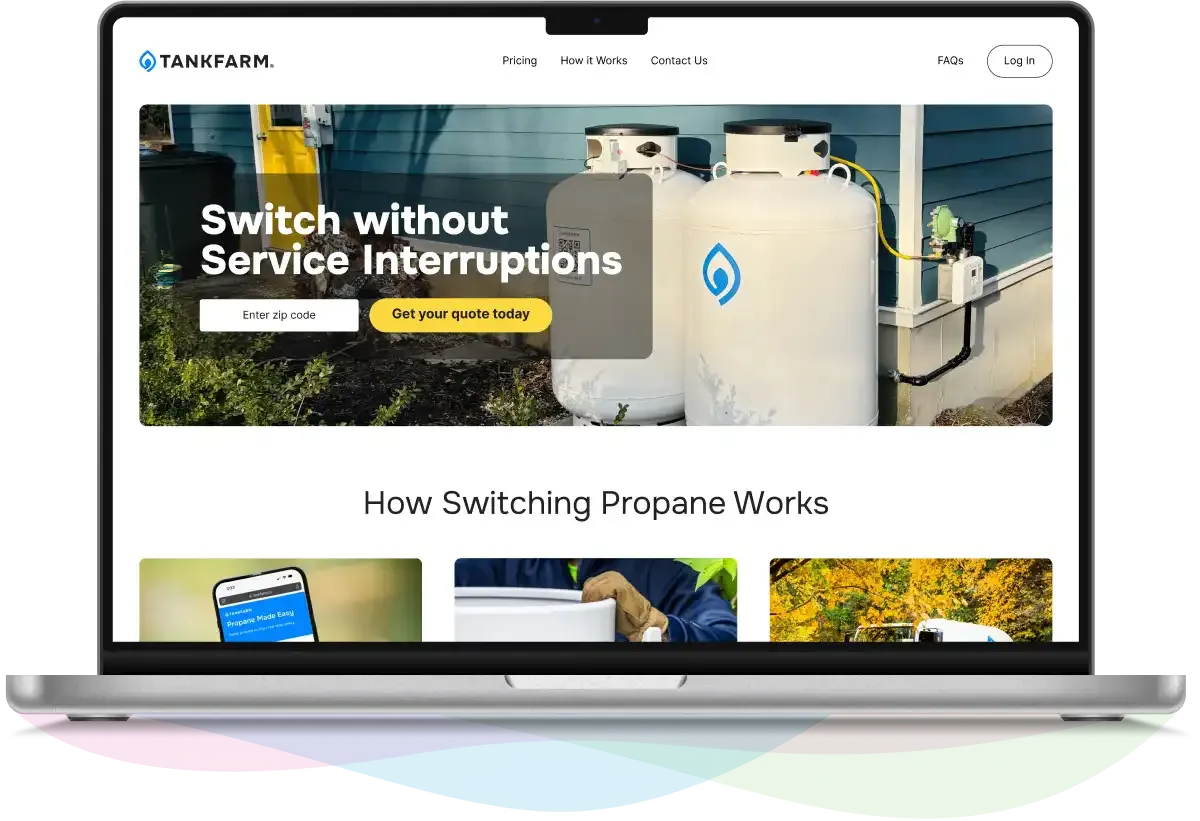
The work is still live at tankfarm.io. The voice, the visual direction, the design system, the redesigned residential app. The numbers held up over the following months. NPS moved from 5 to 9. Qualified leads went up about 35 percent, with customer acquisition cost coming down by a quarter. Calls following up on unqualified leads dropped about a third. Engagement climbed 15 percent inside three months. The design system is in production across product and marketing.
This was brand and product work. Not turnaround. The pivot to direct delivery is capital-intensive in ways no design system can fix. Trucks cost what trucks cost. Installers cost what installers cost.
The engagement ended about a year and a half in, before the pivot was fully realized. The brand work shipped before that. It's still live.
It started with a reframe: reading both sets of customer feedback and trusting what was in them. We heard the position the customers had already given the company, held it, and designed around it.
What looks like the problem at the start is rarely the real problem. The position is usually already in the room, in the customers' words. If you'll listen long enough.