Lead UX Designer · Ventera
Wells Fargo Wealth Management
Wells Fargo asked Ventera to modernize the platform their financial advisors used every day.
Wells Fargo's wealth management group came to Ventera with a brief to modernize the platform their financial advisors used to manage client portfolios, generate reports, and run their books.
A decade of feature additions had piled up. By the time we got there, it felt patched together rather than designed.
The brief was straightforward. What surrounded it was not. Long-tenured advisors had stopped expecting the tool to work for them. New hires from competitor banks were quietly judging the firm by the software they'd been handed on day one. Inside the company, teams disagreed about whether the next move was a backend rewrite or a UX layer. Without a clear read on what was actually broken, the project wouldn't have gotten off the ground.
We were brought in to design a proof-of-concept for a new workflow. We ended up making a quiet argument about who the platform was actually being used by.
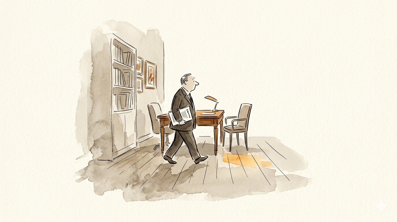
The interviews surfaced something the brief hadn't anticipated. The senior advisors, especially the ones managing high-net-worth relationships, barely used the dashboard at all. They walked into client meetings with paper. The conversations they cared about happened across a desk, with a printed report in hand, not on a screen. It was a report-generation engine, and the people actually using it were the junior advisors who supported them.
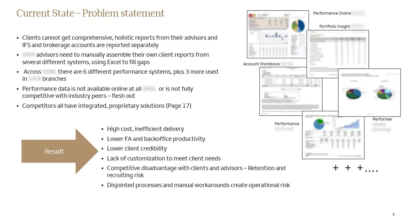
And those juniors were drowning. To assemble a single client report, they were logging into four or five legacy systems, each with its own credentials, navigation, and idiosyncrasies, copying data out by hand, and stitching it together in a working file before the dashboard ever entered the picture. The friction we'd been hired to fix was slow report creation. It was a downstream symptom of an upstream problem. The systems weren't slow; moving between them was.
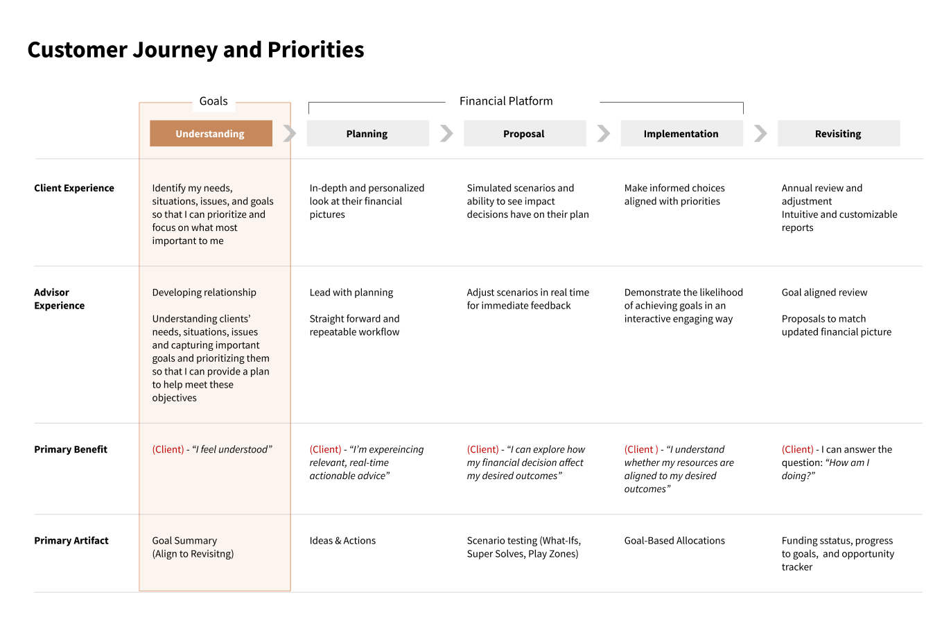
That changed the project. Instead of designing a faster dashboard for the senior advisor on the org chart, we designed a quieter back-of-house for the junior who was doing the actual assembly work. The senior's experience didn't need to change much.
The dashboard wasn't their tool.
A few decisions shaped the redesign.
We left the senior advisor's workflow alone. Their work was the human side: client relationships, engagement, connection, the nuances of long-cultivated trust. No app for the client conversation, no digital “experience” replacing the paper handoff. The moment a senior advisor walks into a room with a printed report is the moment the entire engine exists to serve, and putting a screen in the middle of it would have been a category mistake. The job of the software was to make the prep invisible, not to upstage the conversation.
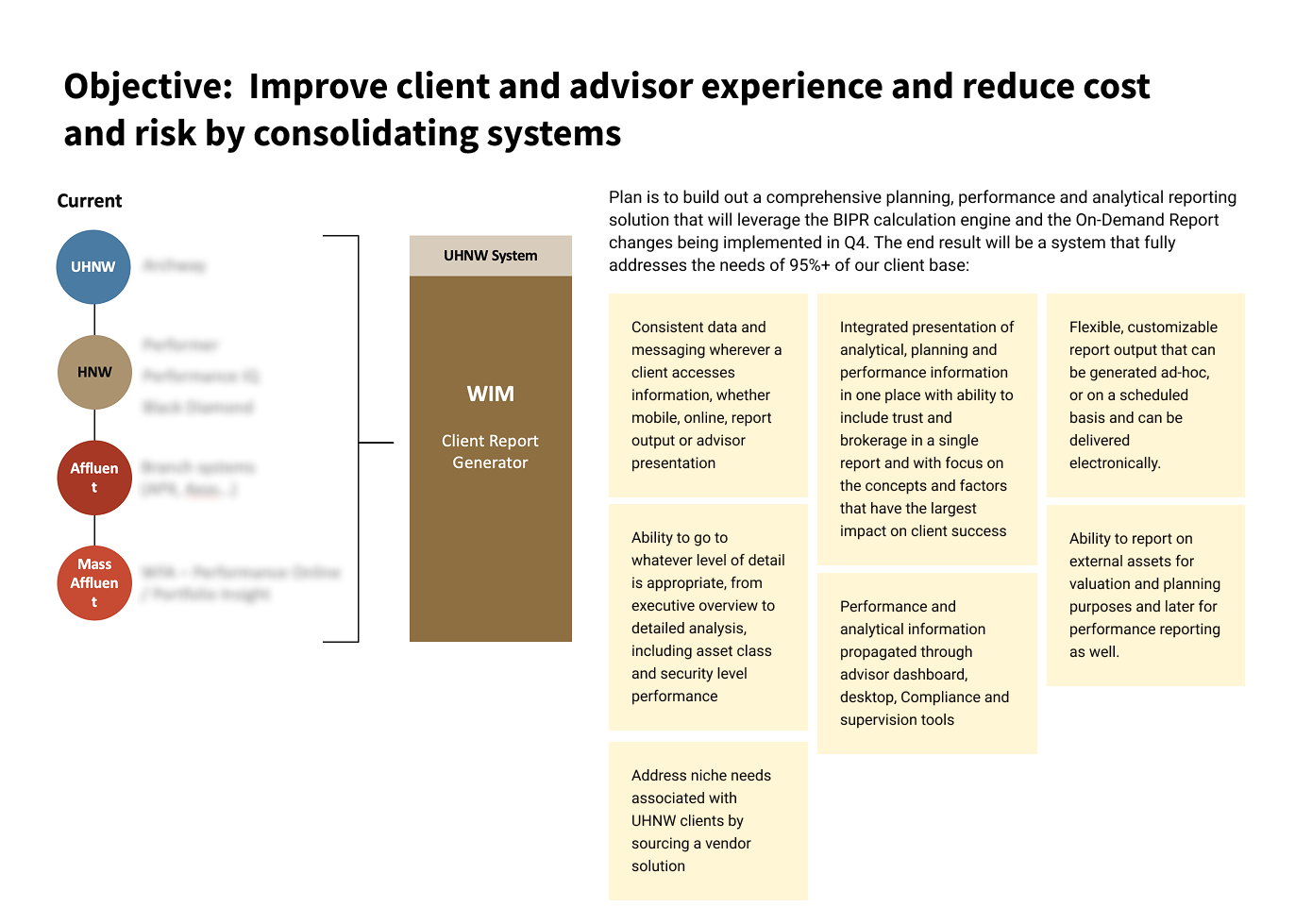
We consolidated the legacy data sources into a single workspace for the juniors. Not by integrating them; that was an engineering decision Wells Fargo's teams would have to make over years. We designed the workspace as if the integration already existed, then mapped a phased path the back-end teams could actually walk. The first phase was a unified export layer that pulled from existing systems without requiring any of them to change. That bought time and credibility for the deeper work.
And we kept the language clear and plain. Every label, every prompt, every confirmation. A junior advisor who has to translate the system's vocabulary into the client's vocabulary is one who'll lean on the senior to double-check everything. That was exactly the bottleneck we were trying to remove.
We handed off concept and direction. Not a build. An interactive prototype of the unified workspace, a phased roadmap that mapped quick wins against the longer integration work, a design system, and a set of high-fidelity mockups that could be carried into build. Wells Fargo's internal teams would take it from there. Whether they did, in what form, and on what timeline. That's a question I can't fully answer, and I'm not going to pretend otherwise. The integration was theirs to build. The direction was theirs to resolve. The thinking held up. That's the part of the work I can stand behind.
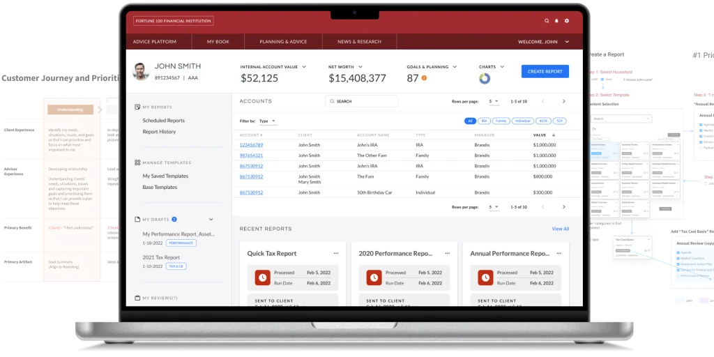
What this project came down to was reading the interviews instead of the org chart. The senior advisors on paper weren't the users. They walked into client meetings with printed reports. The juniors supporting them were the ones logging into five legacy systems and stitching the data together by hand. We designed the back-of-house for those juniors, held plain language across every label and confirmation, and mapped a phased integration path the back-end teams could actually walk.
The interviews almost always know who's doing the work. The org chart often doesn't. The prototype is the artifact. The user-clarity is the deliverable.